CSS Tricks
Table of Contents
CSS Bricks #
Overflow Control #
Prevents horizontal overflow and scrolling on the entire page:
html,
body {
  overflow-x: clip;
}
This is automatically applied when you include the stylesheet.
Full Viewport Height #
Ensures the body element takes at least the full height of the viewport using dynamic viewport height for better mobile support:
body {
  min-height: 100dvh;
}
This is automatically applied when you include the stylesheet.
Typography Enhancements #
Improves text rendering and readability:
body {
  hyphens: auto;
  -webkit-font-smoothing: antialiased;
  -moz-osx-font-smoothing: grayscale;
}
- Automatic hyphenation for better text flow
- Font smoothing for cleaner text rendering across browsers
- Hyphenation is disabled for links and tables to prevent awkward breaks
This is automatically applied when you include the stylesheet.
Prose Styling #
The .prose class provides enhanced typography for article content and long-form text with container-like behavior:
Container:
- Full width
- Centered with automatic inline margins
Typography Helpers:
subelements: styled for multi-line subtitles with top vertical alignment,1.1line height, lighter weight (300), and displayed asinline-blockwith100%width to prevent underline decoration inside links
Links:
- Custom underline offset (
0.1em) and thickness (1pxdefault,2pxon hover) - Anchor links (starting with
#) have no text decoration - Icon helper:
ielements inside links are displayed asinline-blockwith normal font style to prevent underline decoration, with1emheight and0.25emright margin. Nestedimgelements are styled with100%height, no margin, and positioned0.15emfrom the bottom for proper alignment
Headings:
h1elements have a0.5embottom marginh1 subelements get reduced font size (50%)- Support for heading anchors via
.header-anchorclass (displayed on hover to the left of the heading)
Tables:
- Tables within
.breakoutcontainers are automatically styled for full-bleed display and horizontal scrolling - Table cells (
thandtd) have padding of1rem 2rem 1rem 0(extra space on the right for better horizontal scroll on mobile) andtopvertical alignment - Table headers (
th) havebottomvertical alignment - Workaround for widening columns using hidden
hrelements (width:12ch, with zero margin and hidden visibility) - Support for headings in Markdown tables using
bigelements (styled as bold) - Images in table cells have no top margin and
1embottom margin
Blockquotes:
- Lighter font weight (
300) - Adjacent
figcaptionelements (using+ figcaptionselector) are styled with italic text, right alignment, lighter weight (300), negative top margin (-1em), and an em dash prefix (—) with0.25emright margin
Code Blocks:
- Code blocks with
data-captionattribute display the caption above the code block (styled with 50% opacity, italic, and1.5embottom margin)
Code Highlighting #
Includes specialized styling for Prism.js, specifically focusing on treeview components:
- Custom styling for
.token.treeview-part - Reduced opacity for entry lines (25%) and names (50%) to create a hierarchical visual effect
- Entry lines have a fixed width of
2.5em - Last-child entry names have no
::beforepseudo-element - Supports complex file tree visualizations out of the box
Utilities #
Scrollbar Inversion #
The .invert class can be used to invert the scrollbar colors, which is particularly useful for dark themes or specific UI components:
.invert {
  ::-webkit-scrollbar {
    filter: invert(1) !important;
  }
}
Link Whitespace Control #
The .whitespace-nowrap class can be applied to links to prevent them from wrapping, which is particularly useful when links contain icons that should stay with the text:
<a href="#" class="whitespace-nowrap">
  <i><img src="icon.svg" alt="" /></i>Stay with me
</a>
This ensures the icon and the text stay together on the same line. If you need nested elements to allow wrapping, they are automatically reset to white-space: normal.
Usage:
<article class="prose">
  <h1>Article Title</h1>
  <p>Your content here...</p>
</article>
This is automatically included when you import the stylesheet.
Flexbox Layout #
Sets up a flexible column layout structure:
body {
  display: flex;
  flex-direction: column;
}

body > main {
  flex-grow: 1;
}
The body becomes a flex container with column direction, and main elements automatically grow to fill available space. This is useful for creating sticky footers and full-height layouts.
This is automatically applied when you include the stylesheet.
Breakout CSS #
Includes breakout-css utilities for breaking out images and figures beyond their container width. Use the .breakout class to allow elements to extend beyond their parent container:
<div class="breakout">
  <img src="image.jpg" alt="Description" />
</div>
The breakout container has 10% inline padding and a max-width of calc(10% + 65ch + 10%). The breakout utilities support images, pictures, figures, canvas, audio, video, tables, pre, iframe, and other media elements. Tables inside .breakout are specifically enhanced for horizontal scrolling and full-bleed mobile display. This is automatically included when you import the stylesheet.
breakout-css #
Modern CSS utilities to easily break-out / hang / pop-out / bleed images, tables, iframes, and other figures from their parent container.
Installation #
From CDN #
<link
  rel="stylesheet"
  href="https://cdn.jsdelivr.net/npm/@anydigital/breakout-css@1/dist/breakout.css"
/>
From Source #
@import "@anydigital/breakout-css";
^ This is supported by Tailwind v4!
Usage #
Basic Usage #
<div class="breakout">
  <h1>Article Title</h1>
  <p>Lorem ipsum dolor sit amet...</p>

  <!-- This image will automatically break out -->
  <img src="hero.jpg" alt="Hero image" />

  <p>More content here...</p>
</div>
Supported Elements #
The breakout effect automatically applies to direct children or elements wrapped in <p> tags:
Inline blocks:
img,picture,figure,canvas,audio
Larger blocks:
table(responsive with horizontal scroll support),preiframe,object,embed,video
Custom utility classes:
- Elements with
.breakout-itemor.breakout-item-maxclass
Headings & Dividers #
For decorative headings and full-width dividers, use the .breakout-headings class. This adds a subtle accent line to the left of headings and makes horizontal rules span the full viewport width:
<div class="breakout-headings">
  <h2>Section Title</h2>
  <p>Some content...</p>

  <hr />

  <h3>Subheading</h3>
  <p>More content...</p>
</div>
The extension applies to the following elements (when they don't have other classes):
h2,h3,h4(adds decorative accent line)hr(breaks out to full viewport width)
Note: The decorative accent on headings is automatically hidden if the heading immediately follows an <hr> to avoid visual overlap.
Manual Breakout #
For elements that don't automatically break out, use the .breakout-item class:
<div class="breakout">
  <p>Regular content...</p>

  <div class="breakout-item">
    <iframe src="https://example.com/embed"></iframe>
  </div>

  <p>More content...</p>
</div>
Force Maximum Width #
By default, breakout elements use width: fit-content with max-width: 125%, allowing them to size between 100% and 125% width based on their content. To force an element to always use the full 125% breakout width, use .breakout-item-max:
<div class="breakout">
  <p>Regular content...</p>

  <!-- This will always be 125% width, never smaller -->
  <img src="wide-image.jpg" class="breakout-item-max" alt="Wide image" />

  <p>More content...</p>
</div>
Note: .breakout-item-max uses width: 125% !important to override default sizing.
How It Works #
The .breakout container acts as a content wrapper that:
- Sets a smart
max-width: calc(10% + 65ch + 10%)to ensure an optimal reading line length (approx. 65 characters). - Applies
padding-inline: 10%to create the necessary gutter space for breakout elements to extend into.
The breakout effect on elements is achieved by:
- Setting
width: fit-contentwithmin-width: 100%andmax-width: 125%(inline blocks likeimg,picture,figure,canvas, andaudiousemin-width: autoinstead). Tables are handled specially to be full-bleed (max-width: 100vw) with internal horizontal padding (7.5%) and horizontal scroll support. - Using
margin-left: 50%to position from the center of the container - Using
transform: translateX(-50%)to shift it left by half its width
This combination allows elements to extend beyond their parent container (up to 125% width) while remaining visually centered.
The .breakout-headings utility works by:
- Adding a
::beforepseudo-element to headings (h2-h4) positioned to the left. - Using a
100vwwidth and negative translation onhr::beforeto create a full-width divider.
Markdown Support #
The breakout effect works on direct children of .breakout, or elements wrapped in <p> tags (for Markdown compatibility where images are often wrapped in paragraphs).
Pure-CSS Float Label. Finally. #


Now hosted on CDNJS! • And shipped with Bootstrap Kit!
Bulletproof CSS-only implementation of Float Label pattern with automatic fallback for ANY non-supporting browser.
- No JS! Pure CSS!
- No hacks with
requiredand:valid! - ↳ HTML5 validation support!
- Compatible with
<select>and<textarea>fields! - No need to define
for="..."attribute on<label>! v1.0.1+
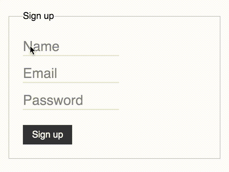
Demo #
Usage #
Include float-label.min.css:
<link rel="stylesheet" href="https://cdn.rawgit.com/tonystar/float-label-css/v1.0.2/dist/float-label.min.css"/>
Use <label> with .has-float-label class as a wrapper for <input> v1.0.1+:
<label class="has-float-label">
  <input type="email" placeholder="email@example.com"/>
  <span>Email</span>
</label>
NOTE:
- W3C allows this.
<span>should go after<input>.
Alternatively wrap <input> and <label> by .has-float-label:
<div class="has-float-label">
  <input id="email" type="email" placeholder="email@example.com"/>
  <label for="email">Email</label>
</div>
NOTE:
- W3C allows this as well.
<label>should go after<input>.for="..."attribute is required on<label>.
Quick use: Bootstrap #
Instead of float-label.min.css just include pre-built bootstrap-float-label.min.css:
<!-- Bootstrap v4 -->
<link rel="stylesheet" href="https://cdn.rawgit.com/tonystar/bootstrap-float-label/v4.0.0/dist/bootstrap-float-label.min.css"/>

<!-- Bootstrap v3 -->
<link rel="stylesheet" href="https://cdn.rawgit.com/tonystar/bootstrap-float-label/v3.0.0/dist/bootstrap-float-label.min.css"/>
Markup is the same. For more details see: /tonystar/bootstrap-float-label.
Credits #
- @mds for the original pattern
- @chriscoyier for the
input:focus + label - @thatemil for the
:placeholder-shown
Browser support #
Any browser with :placeholder-shown CSS pseudo-class: /#feat=css-placeholder-shown.
All non-supporting browsers will fall back to the static layout (w/o animation).
=> Can be used in ANY browser as is!