Business Banking Onboarding Redesign
The goal of the project was to update the existing product’s UX and enrich its functionality on top of the 60% of design and code assets inherited from the previous team.
The ultimate output of the Product Design and Frontend teams included:
- creating the missing UX scenarios and fine-tuning the existing ones;
- updating UI Design System according to UX corrections;
- building new features in ReactJS.
Design solutions walkthrough:
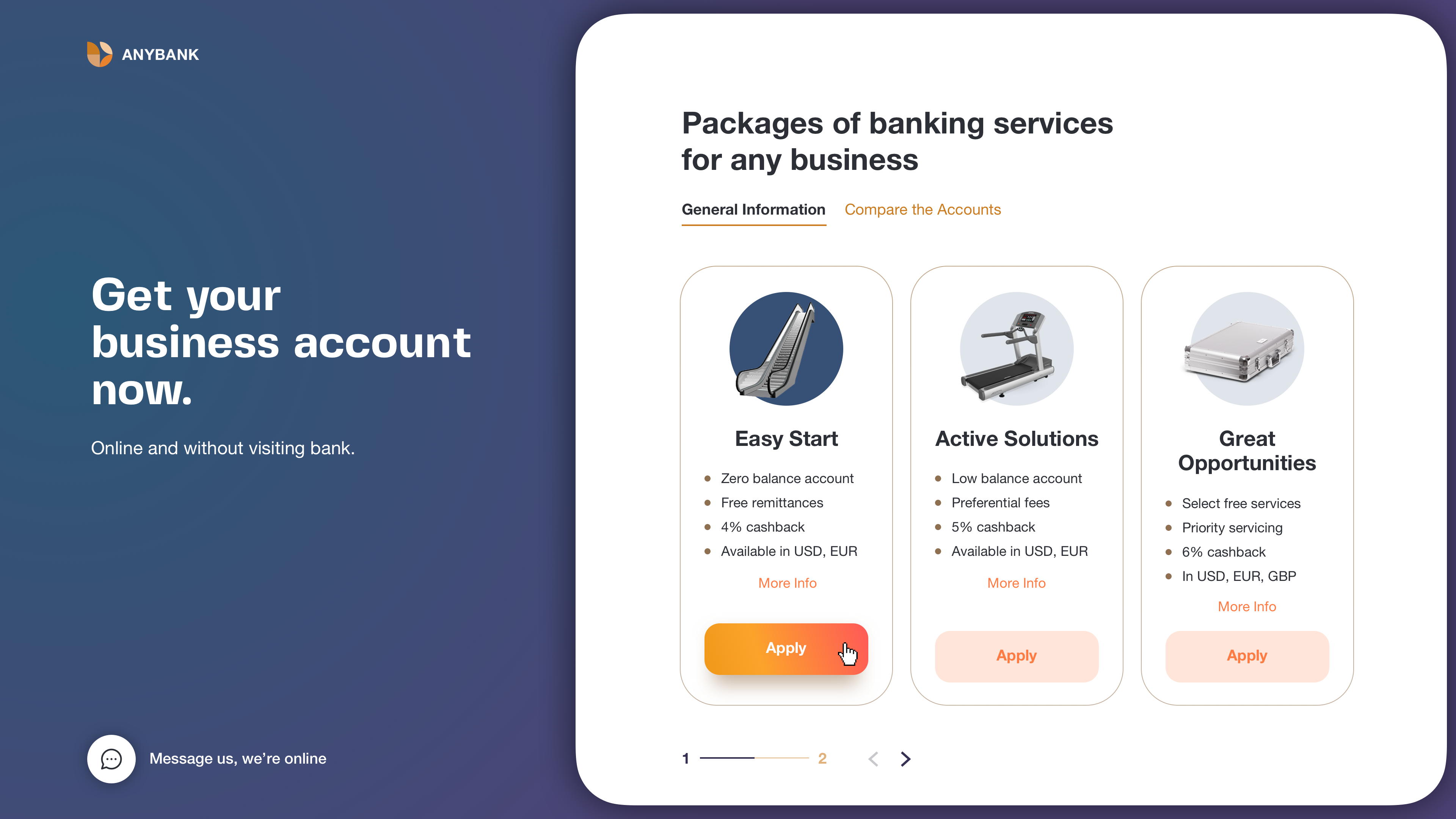
Neat and clean service overview
We created a simple and clean first page.
The accent is on accounts cards with general information and a comparison table.
Users access the page from the primary bank website, so there is no need in any additional bank presentation or company/service details.
We put all the important information about a specific account on one scrollable block. By clicking the «Apply» button user will go «inside» the application service.

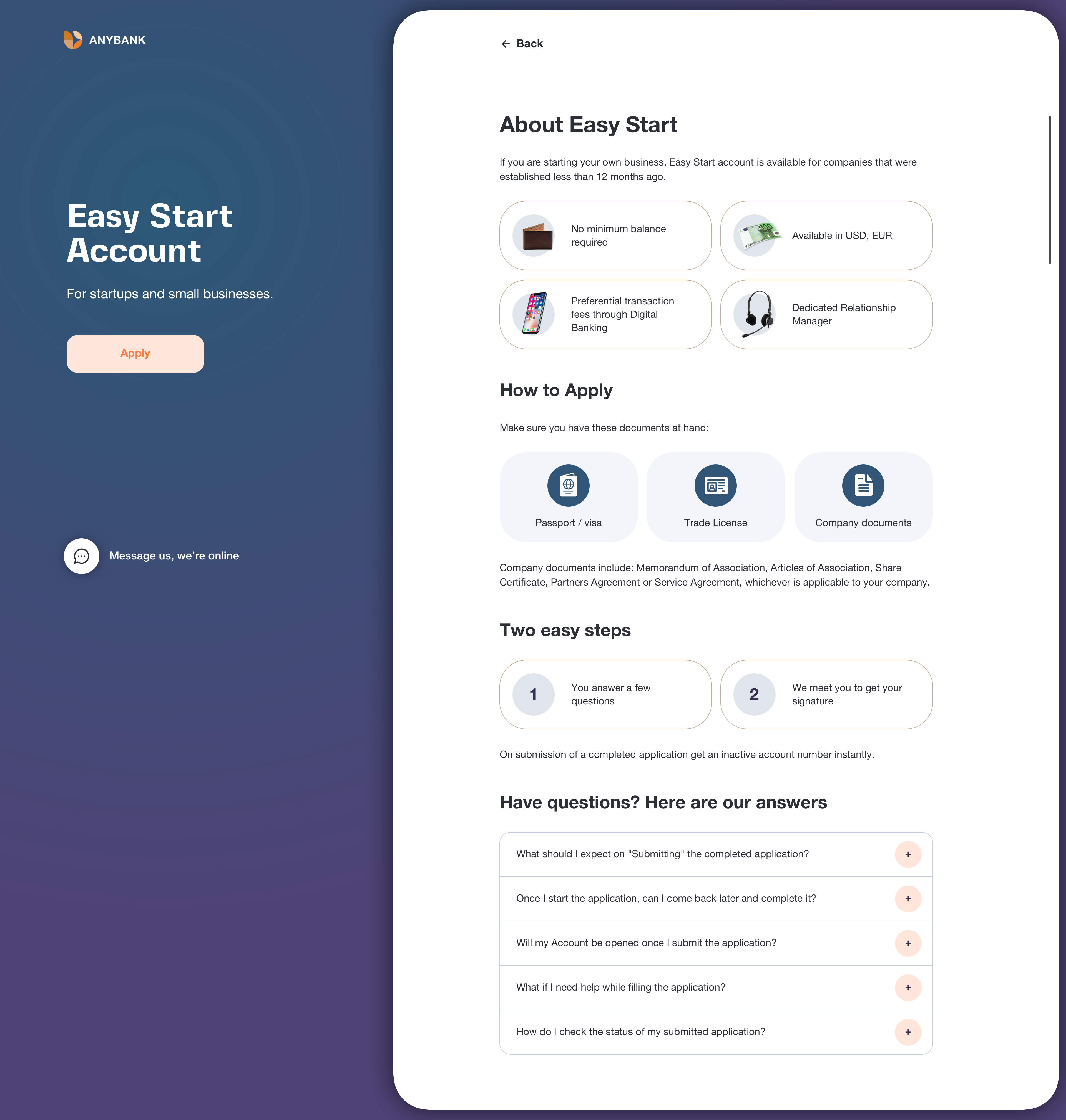
Easy start of the journey
Here user starts the journey.
We’ve split the long way into 5 steps to simplify user acceptance of this massive of questions.
The primary button is aligned to the left edge of the inputs, so it clearly communicates how to go about completing a form.
This alignment also helps screen magnifier users to see it without having to pan across. We provided a form-specific back button as some users are afraid of losing their data while clicking the browser’s “Back”.
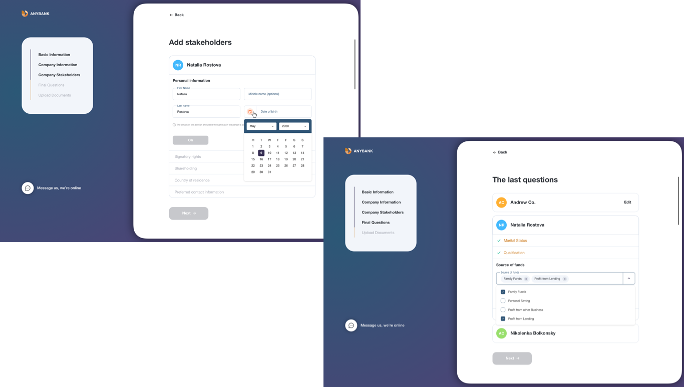
Step by step navigation
Also, we’ve split each step into several cards and accordions. By clicking «OK» button we send user’s data to a server, and it’s not only about convenient navigation between accordion sections but also a development decision for better data safety.
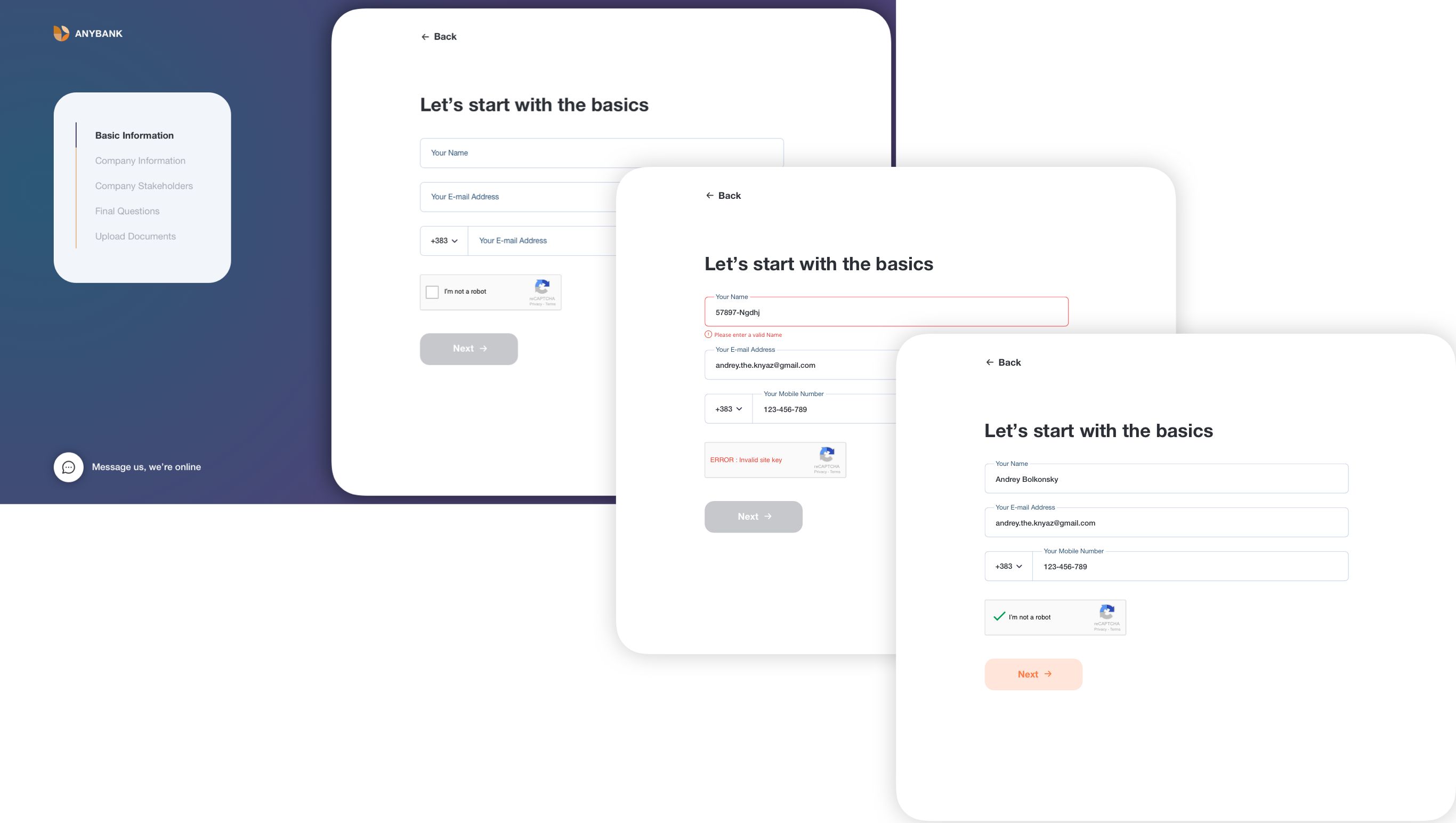
Also, we’ve split each step into several cards and accordions. By clicking «OK» button we send user’s data to a server, and it’s not only about convenient navigation between accordion sections but also a development decision for better data safety.
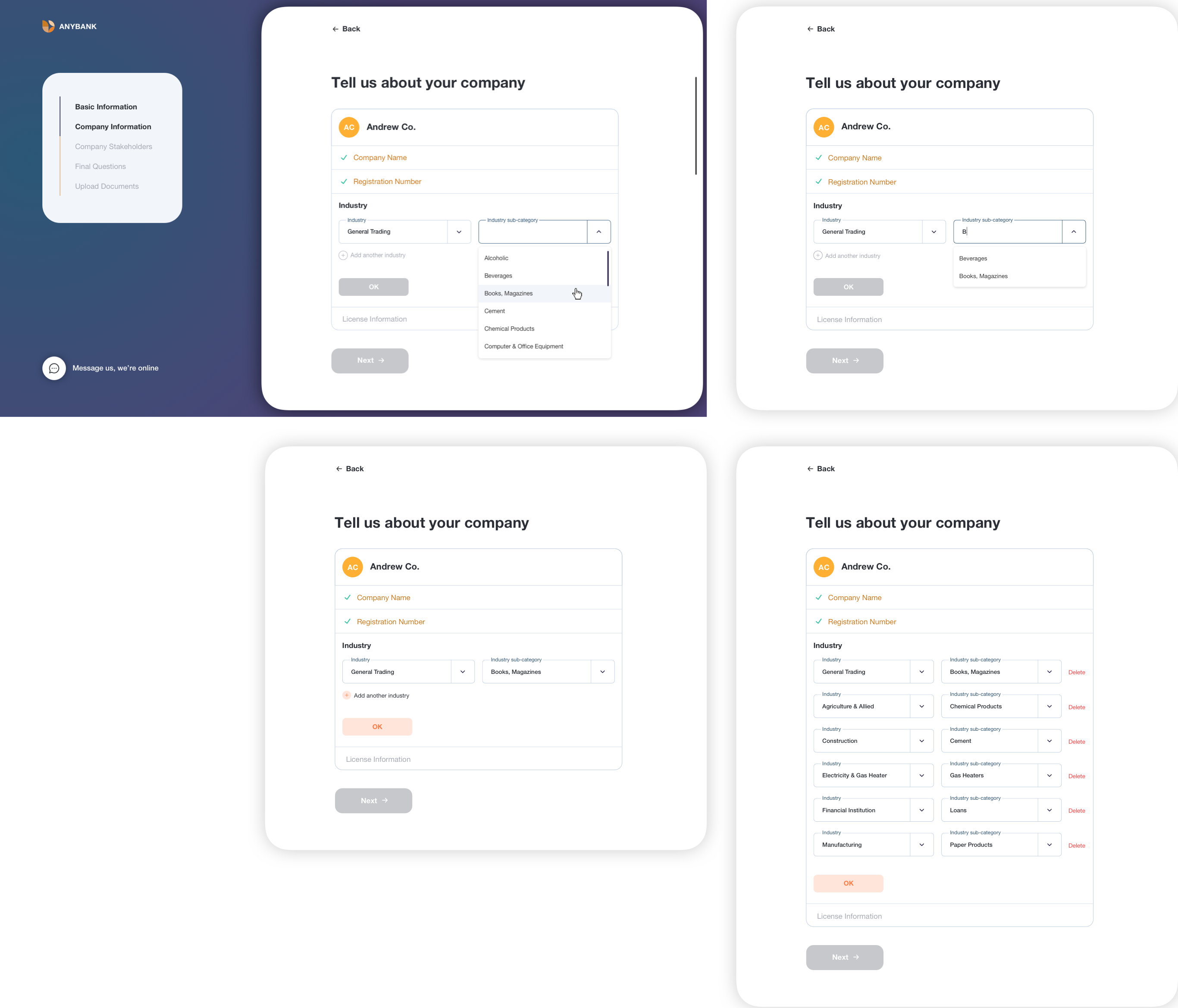
There are several fields type: single-line text fields, multi-line text fields, text areas, dropdowns, dropdowns with multiple selections, date pickers.
For the best user experience, we’ve added the opportunity of manual date-picking as well as selection from a dropdown.
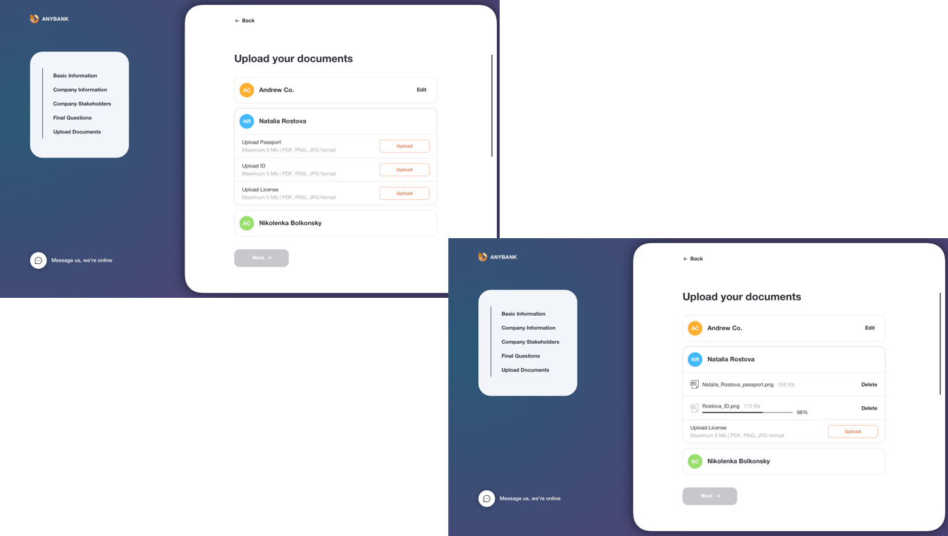
On the «Upload documents» screen we’ve added texts with files format and maximum files size information to prevent unpleasant errors.
There is also a simplest table for checking applications status.
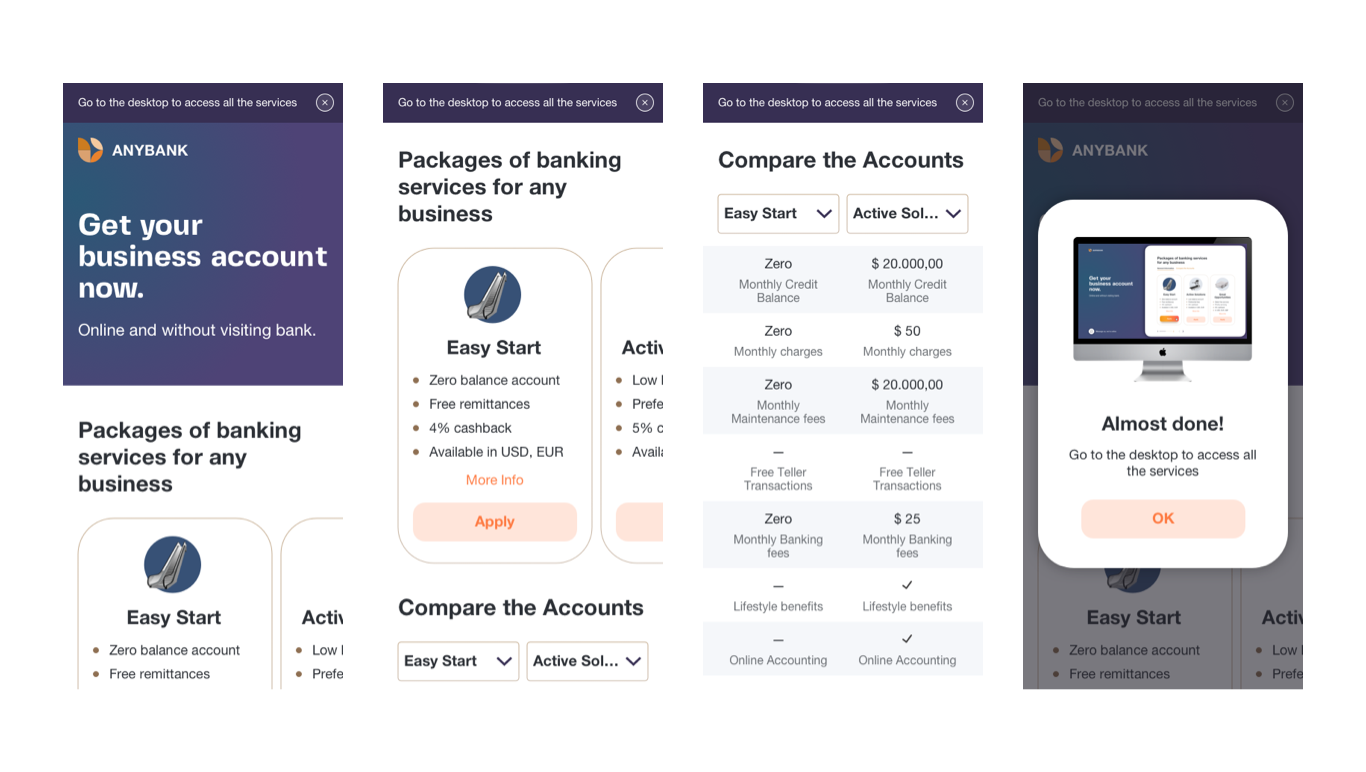
Back to desktop
As business made a decision not to enable full responsiveness for the service, we’ve created a mobile version just for the first informative screens.
To fill the application user needs to go to the desktop version.
We’ve added a narrow banner with a proper message at the beginning of all mobile screens. By clicking «Apply» user will see a popup message.
Tools and technologies
Sketch, Overflow, After Effects, ReactJS