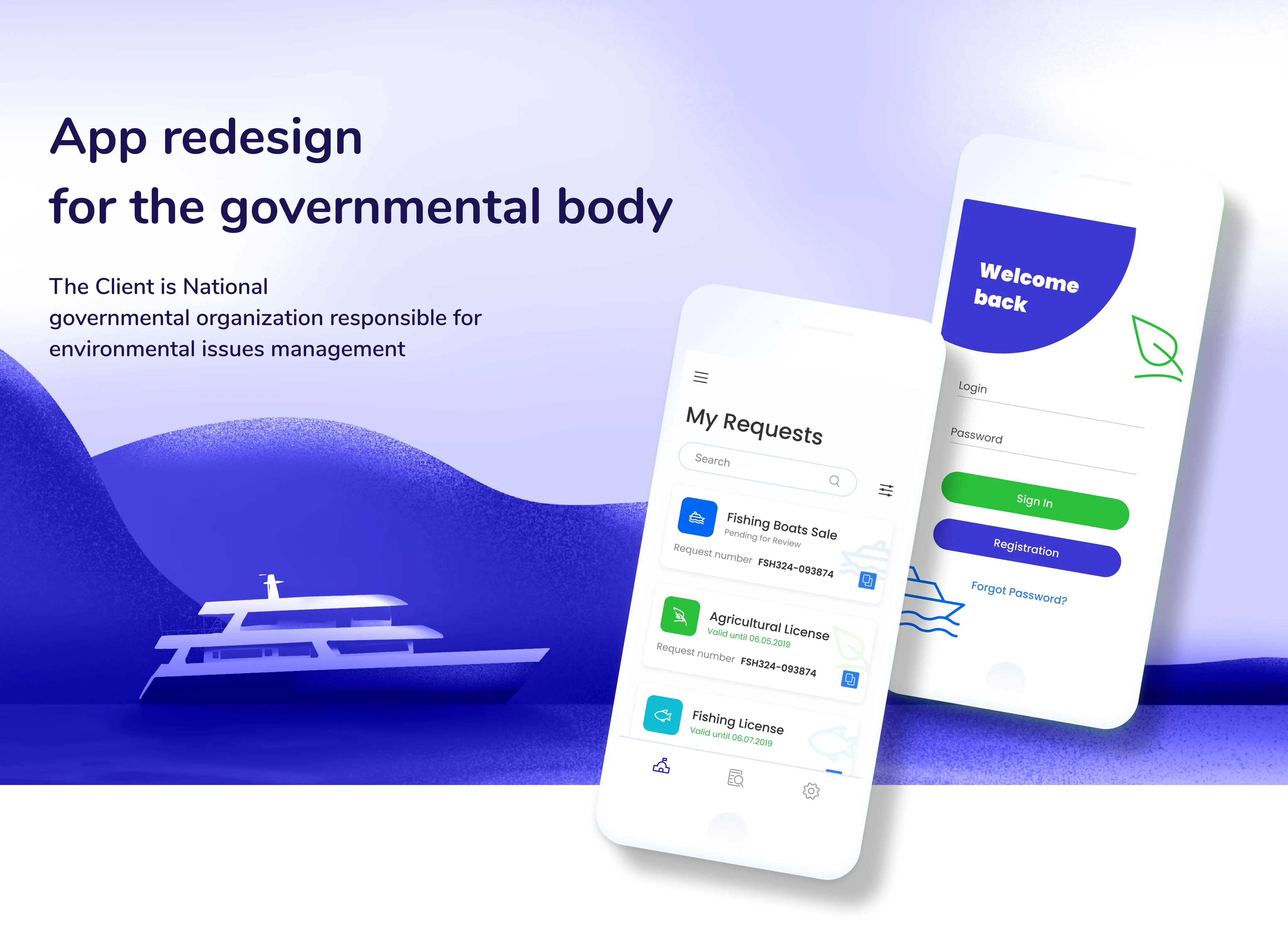
App Redesign for the Governmental Body
Table of Contents
The Client is a National governmental organization responsible for environmental issues management
Brief
The goal was to completely revamp the navigation, enable smart filtering and search, to align the look and feel of the website with WCAG standard, to enhance the accessibility of the key services of the organization.

Challenges
Time limits — the first version of concepts was scheduled to be ready in 48 hours.
Inadequate clarity/analytics data from the client-side — it was our team’s responsibility to determine the pivotal problems that the service would solve for the users. Insufficient info on the target audience — this wasn’t provided by the client as well, so we opted for one-fits-all design solutions that would enhance the overall look and feel for the user.

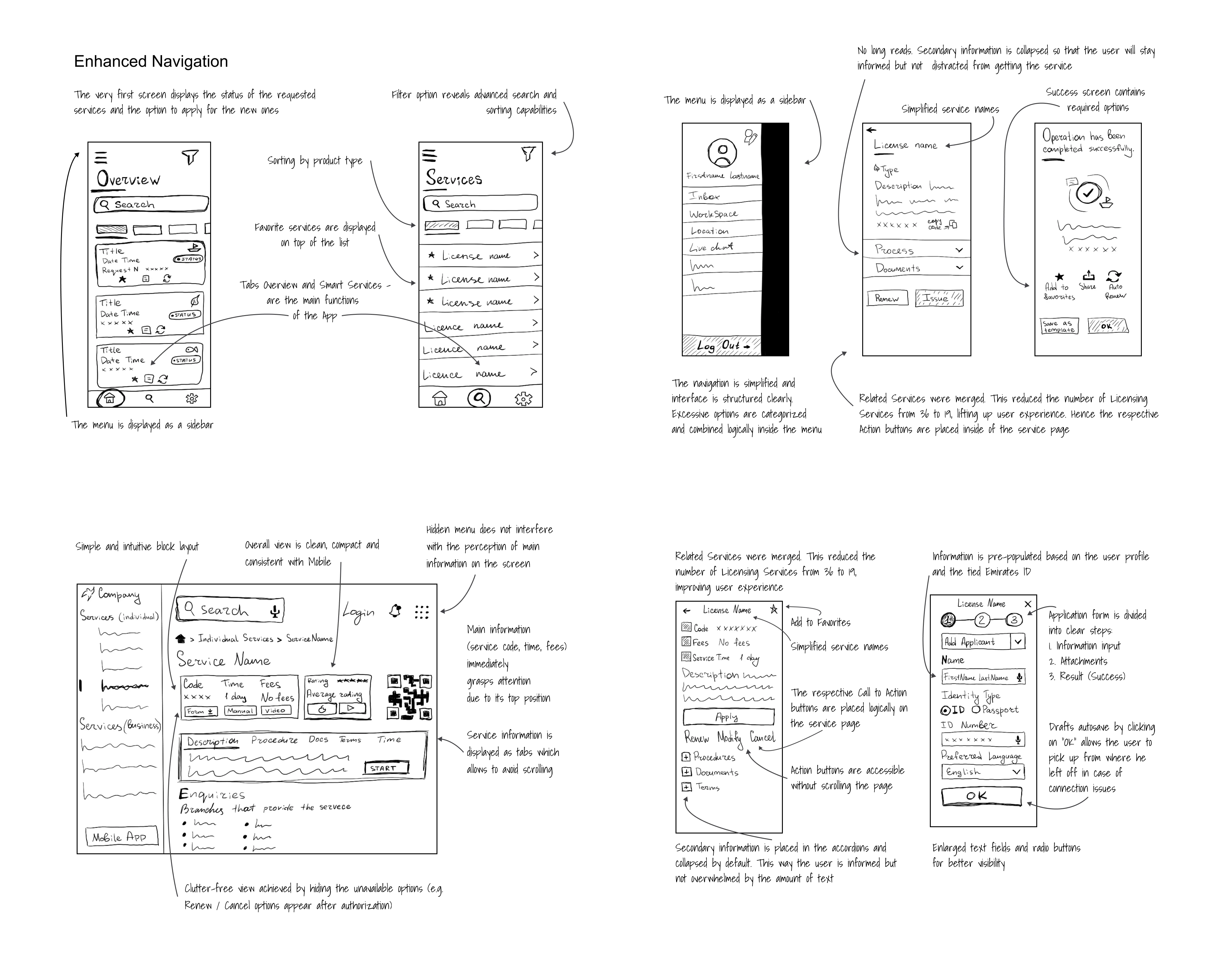
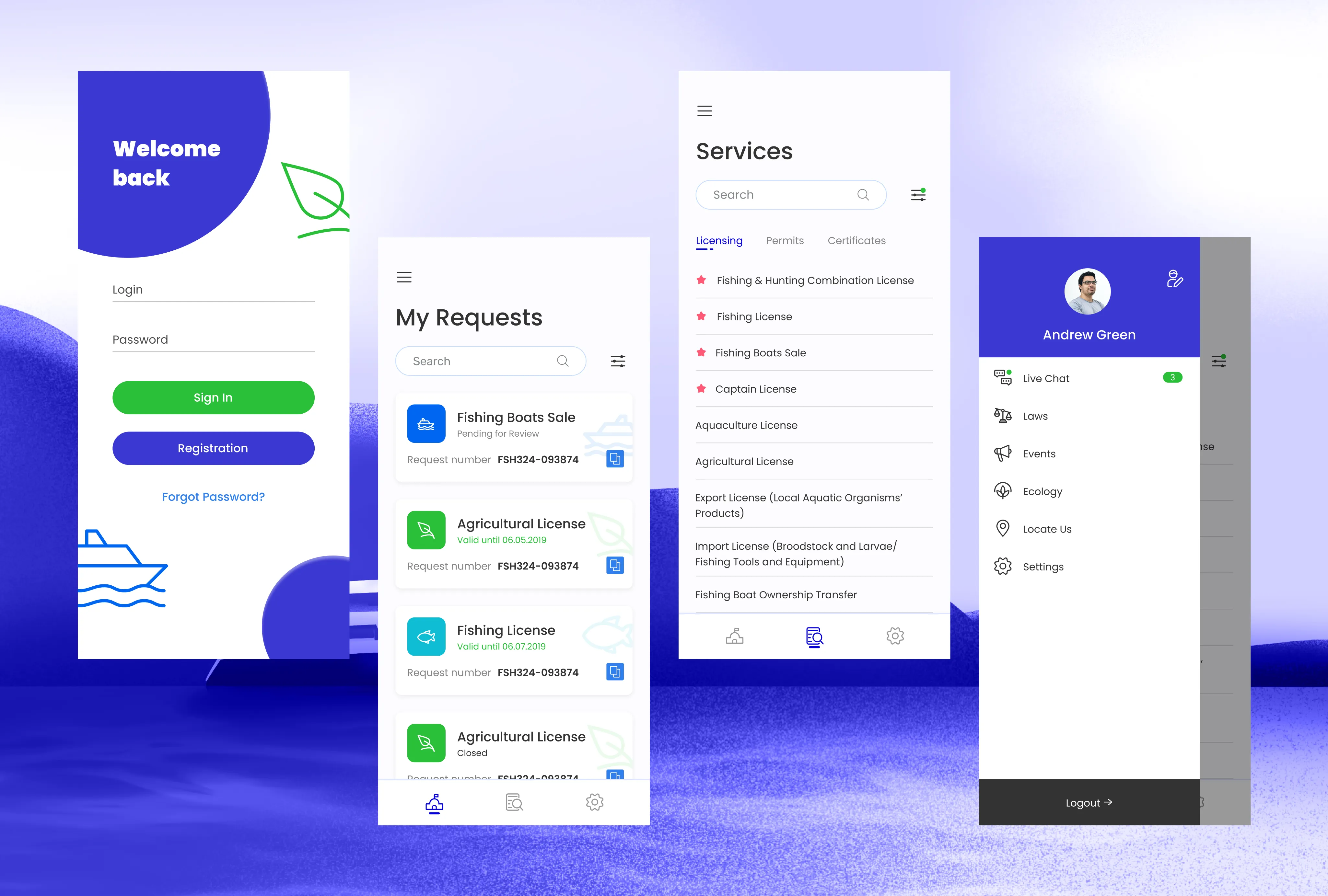
As a result of self-testing the web and mobile apps, we’ve determined the key areas for improvement — confused filtering and navigation, inconsistency between the two platforms, an overload of irrelevant info on the main page preventing people from achieving their main goal — receiving a license.

Design solutions
Our main achievements on the service redesign included:
For mobile apps:
- provided redesign for the iOS/Android platforms;
- minimized iconography and maximized typography to simplify user’s search process stylistic and functional consistency with the web.
For the web:
- leveraged the info ergonomics to provide that simple and intuitive layout and avoid scrolling;
- elevated the position of the main info (service code, time, fees) to make it instantly visible to the users;
- decluttered the web space by hiding unavailable options and menu from the main screen.
Press enter or click to view image in full size
Overall
- enabled component consistency between web and mobile
- enhanced navigation and filter option (enabled advanced search and sorting capabilities)
- eliminated distraction for the user (collapsed secondary info, prioritized main app features — overview/smart services, simplified service names
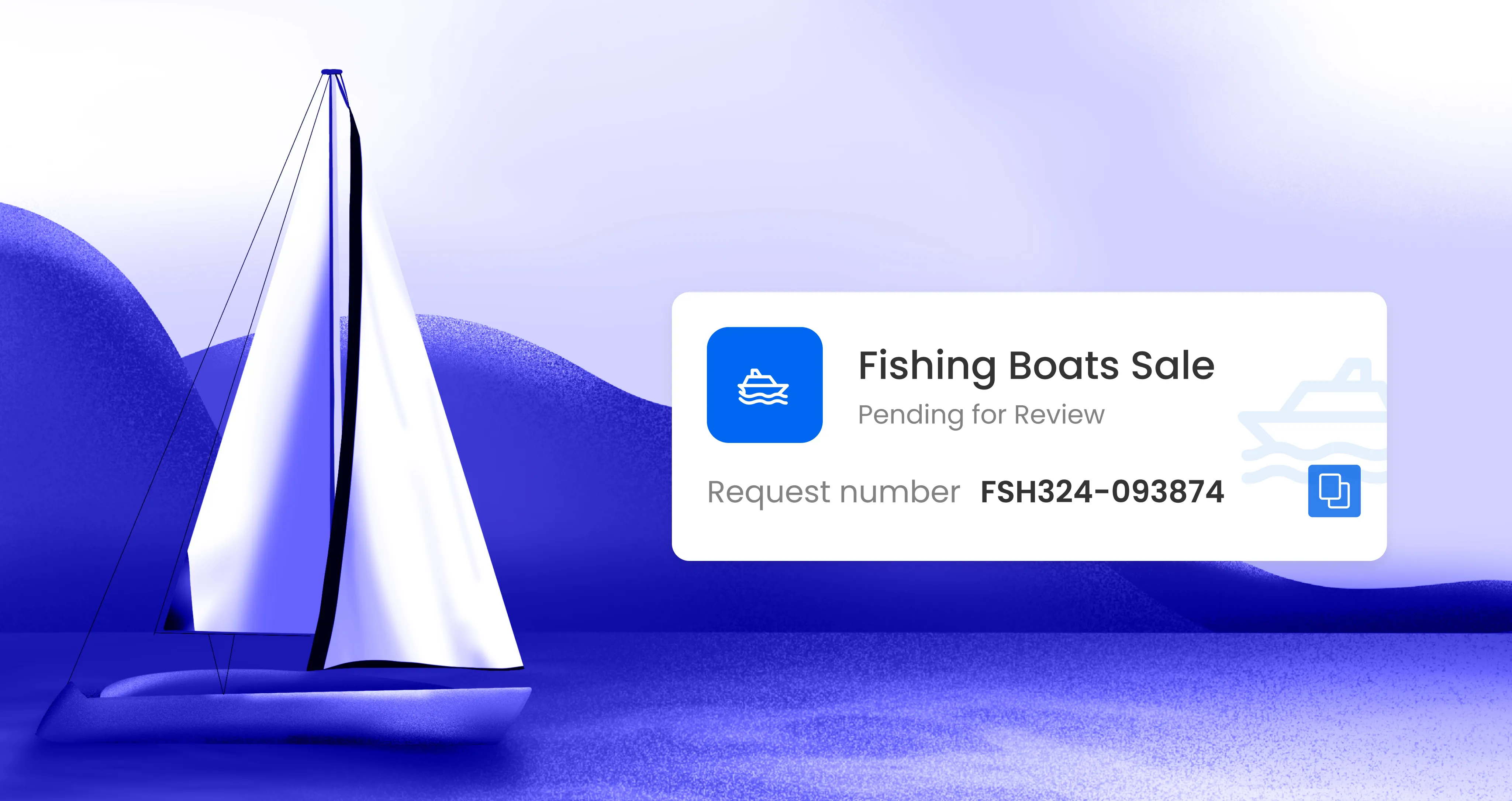
- elevated UX through merging related services (from 36 to 19), attaching favorite services to the top of the list, putting action buttons inside the service page, and utilized the “share” feature for the success state
- the user-centered design achieved by component tweaks, addition of essential functionality (add to favorites, draft autosave), more intuitive call-to-action buttons layout.
Outcome
As the design team, we’re motivated to provide a consistent and efficient experience for the user as well as alleviate the achievement of the user’s main goals.
On top of that, we’ve ensured the alignment with accessibility standards within a limited time frame and without much background info from the client-side.
Tools
Figma, Adobe Illustrator, Procreate, Adobe After Effects